
Cleats, Colors, and Couture: NFL Uniforms Ranked

NFL jerseys aren't just uniforms; they're personal statements that set the tone of each team's city and traditions. From bold classics, to designs that are fashion fumbles, we're ranking the top ten NFL home jerseys, from worst to best.
10. Chicago Bears

The Bears have a signature look that hasn't changed much over the years, making it deserving of a spot in the top ten. The bold "C" helmet and striped sleeves are easily recognizable, with a traditional touch of navy blue. Though iconic in some ways, it is a bit safe compared to other jerseys that are higher on this list.
9. Miami Dolphins

With its iconic color palette of bright teal and orange, Miami's uniform earns a spot in the top ten due to its distinctive look. While it's fun and easily spotted, some people find the teal too bold compared to some sleeker jerseys higher on the list. Although it's cheerful and unique, it doesn't quite capture the timeless elegance that the NFL tries to keep alive.
8. Las Vegas Raiders
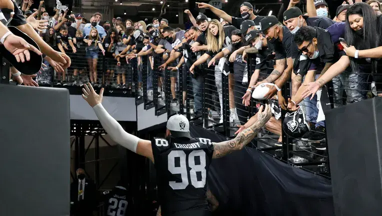
Though some may say it's too simple, it's hard to argue that the Raiders' uniform isn't sleek and intimidating. The black and silver jersey has barely changed over time and that's because it doesn't need to: it's bold without having too much going on and matches the Raiders' frightening persona. While it will forever be a classic, the uniform is too safe to be considered a showstopper in the league.
7. Dallas Cowboys

As one of the most recognizable looks in the league, it's no surprise that the Cowboys are amongst the top ten. The crisp white base and iconic star on the helmet create the ultimate clean and polished jersey, with silver and blue accents making it classic. The addition of the light blue pants gives it an extra flair that other looks lack. While its iconic style opened the door to the top ten, the predictability of Dallas' uniform prevents it from being a top contender.
6. Minnesota Vikings

The Vikings sport one of the few NFL jerseys that has a bold color you almost never see on the field, instantly making it a recognizable piece. The deep royal purple with gold accents is both regal and playful, and the horns on the helmet tie the Vikings aesthetic together in a subtle way. Purple is a power color, but not exactly everyone's favorite, making it an option that may be too loud for some fans. Nevertheless, it's a gorgeous jersey with tradition and personality, earning it a spot in the top ten.
5. New Orleans Saints

Effortless elegance is the definition of the Saints' uniform. The black and gold combo is luxe, dramatic, and mysterious while not being too plain. The fleur-de-lis detailing ties into the city's French-inspired culture, making the jersey stylish and traditional. Though the palette is classy, it's a little understated compared to other uniforms in the top five. However, if they ever add a beignet to the jersey, it would get my vote as No. 1.
4. Kansas City Chiefs

The Chiefs' bright red uniform is a display of pure passion that owns the spotlight every time. Paired with clean white numbers and a hint of gold, the jersey is bold and makes a statement with its iconic color palette. The red is distinctive, but can be overwhelming, making it a piece that's not very versatile for fans. Still, the jersey's allure has that championship shine, earning it a spot in the top five.
3. Philadelphia Eagles

At third place, the Eagles' jersey is the perfect balance of bold and classic. The midnight green is unique in the league, being distinct but not too flashy. Black, white, and silver accents make the uniform feel modern, sleek, and a little intimidating. It's striking and stylish, but maybe not the first jersey that comes to mind when you think of an iconic NFL look. However, the uniform is still one of the best mixes of tradition and modernity in the league, earning it a spot in the top three.
2. New England Patriots

A classic American look with a modern twist makes the Patriots deserving of the second best uniform in the NFL. The deep navy blue paired with bold red and white feels patriotic without being cliché. It balances tradition with edge, making it one of the most wearable jerseys. As iconic as this look is, it doesn't quite have the perfect balance of functionality and style that the jersey at number one does.
1. Carolina Panthers

The Panthers' home jersey is the perfect example of fashion meeting football. The electric "Panther" blue is bold, vibrant, and pops out, making it look amazing styled on and off the field. Paired with black and silver accents, the jersey is the perfect balance of sleek and fierce. It earns the number one spot by having a unique color way, modern design, and a fresh vibe that holds its identity. Out of all 32 teams, the Panthers' home look is the most striking yet classic, earning its crown at the very top.
Edited by: Isabella Messerli


b33 có cách trình bày khá hợp gu mình, nhất là kiểu giao diện phẳng, nhìn nhẹ mắt chứ không quá cầu kỳ. Mình hay đọc web lúc nghỉ một chút nên thích trang nào nhìn vào là biết nên bắt đầu từ đâu, không phải dò cả màn hình. Nội dung thì mình mới xem qua thôi, chưa có gì để nhận xét sâu, nhưng phần chia mục tạo được thiện cảm ban đầu. Thường gặp bài viết kéo dài mà ít chỗ ngắt là mình mất kiên nhẫn khá nhanh, dù đang muốn đọc tiếp. Ở đây nhìn tiêu đề là biết đoạn bên dưới nói về chuyện gì, nên có thể chọn phần mình tò mò trước.…
88aa có phần giao diện hiện đại khá hợp mắt mình, không cần giới thiệu quá nhiều mà nhìn vẫn thấy có nét riêng. Mình hay để ý hình thức trước khi đọc nội dung, nên kiểu trình bày này dễ khiến mình dừng lại xem thêm hơn là lướt qua luôn. Còn mấy thông tin giới thiệu về trang thì mình chưa tìm hiểu kỹ, thành ra cũng không bàn tới. Một điểm mình thấy hay là nội dung thể thao có cả bóng đá lẫn bóng rổ, đỡ cảm giác chỉ tập trung vào mỗi bóng đá như mình thường nghĩ. Ai theo dõi hai môn này chắc sẽ chú ý phần đó trước. Mình thì mới xem…
8xbet dạo này mình thấy có người nhắc tới khi nói về các nền tảng giải trí trực tuyến nên cũng thử mở vào xem cách họ bố trí giao diện ra sao. Mình không đi sâu vào nội dung hay từng trò cụ thể, mà chủ yếu quan sát cách các chuyên mục được phân chia trên trang và cách thông tin hiển thị cho người dùng. Nhìn tổng thể thì các khu như thể thao, casino, game bài hay slot thường được sắp xếp theo từng nhóm khá rõ, hiển thị dạng khối và danh sách nên lướt qua cũng dễ theo dõi. Các bảng dữ liệu được trình bày dạng cột khá gọn, giúp quan sát nhanh…
fv88 mình mới xem qua, chủ yếu để ý cách chia nội dung chứ chưa tìm hiểu kỹ từng phần bên trong. Mình hay có thói quen lướt các tiêu đề trước, thấy mục nào nói rõ nội dung thì mới dừng lại đọc, chứ chữ dồn thành một đoạn dài là hơi ngại. Ở đây có phần giới thiệu riêng với mục tin tức nên nhìn qua cũng biết nên tìm thông tin ở đâu. Mình thích kiểu trình bày thẳng vào chủ đề như vậy, không cần đọc hết ngay từ đầu mới hiểu trang đang nói gì. Phần tổng hợp các sảnh cũng có tiêu đề riêng, tách với phần giới thiệu chung nên lúc kéo xuống…
qs88 nhìn qua thấy khá dễ theo dõi, nhất là với người hay lướt nhanh như mình. Mình thường chỉ đọc vài dòng rồi nhìn quanh trang một lượt, chỗ nào dồn quá nhiều thứ vào nhau là dễ bỏ sót thông tin lắm. Ở đây các phần được chia riêng nên đỡ phải đoán đoạn nào nối với đoạn nào, cũng không cần đọc hết mới nắm được cách sắp xếp. Mình mới xem bên ngoài thôi, chưa thử các chức năng nên chỉ nói chút về giao diện. Có để ý thêm là nút đăng ký và đăng nhập khá dễ thấy, không phải kéo lên kéo xuống tìm như đôi khi mình vẫn gặp ở mấy trang…